The importance of colour psychology in a logo design

Eloqeye Graphic design | 'eyeconise' your brand message | Professional logo and business card designs for your business

The importance of colour psychology in a logo design

The importance of colour psychology in a logo design
Eloqeye Graphic design: the importance of colour psychology in a logo design-blog-image
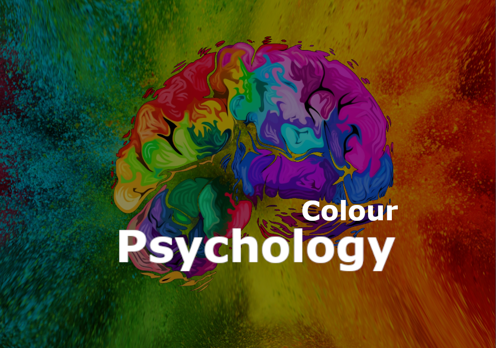
In the world of branding, logo design is one of the most important aspects that can make or break a company's success. A logo is the visual representation of a company, and it is the first thing that a customer will see. One of the key elements of logo design is colour, and the psychology of colour is a crucial aspect that must be considered when designing a logo. In this blog post, we will explore the importance of colour psychology in logo design and how different colours can evoke different emotions.
The Importance of Colour in Logo Design
Colour is a powerful tool that can evoke emotions and feelings. When it comes to branding and logo design, colour can help to create a strong visual identity that resonates with customers. Colour can communicate a company's personality, values, and messaging. For example, a bold and bright colour like red can convey energy and passion, while a muted colour like grey can convey professionalism and sophistication. When designing a logo, it is important to consider the target audience, the company's industry, and the brand's messaging to choose the right colours.
Red
Red is a bold and powerful colour that can evoke emotions such as passion, energy, and excitement. It is often used by companies that want to create a sense of urgency or to grab attention. Red is commonly used by fast-food chains such as McDonald's and KFC, as it is believed to stimulate appetite and create a sense of urgency. Red is also associated with love and romance and is often used in the beauty industry.
Blue
Blue is a calming and soothing colour that can evoke feelings of trust, reliability, and professionalism. It is often used by companies that want to create a sense of trust and dependability, such as banks and financial institutions. Blue is also associated with technology and is commonly used by tech companies such as IBM and Dell.
Green
Green is a natural and calming colour that is often associated with growth, health, and harmony. It is commonly used by companies that want to promote eco-friendliness or sustainability, such as Whole Foods and The Body Shop. Green is also associated with wealth and money and is often used by financial companies and investment firms.
Yellow
Yellow is a bright and cheerful colour that can evoke feelings of happiness, optimism, and warmth. It is commonly used by companies that want to create a sense of friendliness and approachability, such as Best Buy and IKEA. Yellow is also associated with caution and warning and is often used in road signs and construction sites.
Conclusion
In conclusion, colour psychology plays a crucial role in logo design. Different colours can evoke different emotions and feelings, and it is important to consider the target audience, the industry, and the brand's messaging when choosing the right colours for a logo. By using colour effectively, a company can create a strong visual identity that resonates with customers and helps to build a strong brand.

Creative design solutions for all your brand image

Looking for high-quality graphic design services? Look no further! I offer professional and creative design solutions for all your branding needs. Contact me today!
Contact us for:
Logo designs
Business card designs
Flyers and brouchers designs
Contact info
Eloqeye custom logo